Trending in 2014 - bold, saturated colors! Throughout the New York Gift Show, the strength and presence of rich colors was abundant!
Below: Outpost Original

 Color is one of the first things that people think of when design and furniture trends come to mind. This year, neutral tones are taking a backseat to more richly saturated colors like navy and emerald! While these bold colors make a striking statement, they also blend extremely well with many other tones and can instantly transform a space into a stylish statement rather than just another room. Compared to muted tones, saturated colors from the color wheel tend to raise our energy levels and make for a much more eye-popping design!
 Color is one of the first things that people think of when design and furniture trends come to mind. This year, neutral tones are taking a backseat to more richly saturated colors like navy and emerald! While these bold colors make a striking statement, they also blend extremely well with many other tones and can instantly transform a space into a stylish statement rather than just another room. Compared to muted tones, saturated colors from the color wheel tend to raise our energy levels and make for a much more eye-popping design!
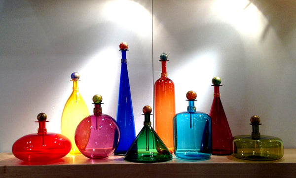
 Above: Vetro Vero
 A rich, saturated color is a nice change of pace from the muted tones that were prominent in design a few years ago. Think BOLD, VIBRANT, ADVENTUROUS and ENERGETIC! Although there's something to be said for pretty and natural, lately designers are crossing over to the dark side! Deep, saturated colors are thriving in the interior market compared to muted neutrals and earthy tones and we couldn't be more excited!
 A rich, saturated color is a nice change of pace from the muted tones that were prominent in design a few years ago. Think BOLD, VIBRANT, ADVENTUROUS and ENERGETIC! Although there's something to be said for pretty and natural, lately designers are crossing over to the dark side! Deep, saturated colors are thriving in the interior market compared to muted neutrals and earthy tones and we couldn't be more excited!
 Above: Zoe Creative
 How to DIY the saturated color trend? Combining brights and neutrals is a wonderful to way to embrace this trend without overwhelming your decor! When you have a strong, saturated color, it is best to tone it down with some muted tones or neutrals and accent with some glamorous metallic touches.
 How to DIY the saturated color trend? Combining brights and neutrals is a wonderful to way to embrace this trend without overwhelming your decor! When you have a strong, saturated color, it is best to tone it down with some muted tones or neutrals and accent with some glamorous metallic touches.
 Above: Vetro Vero
Stop by our Philadelphia showroom or shop our online store today to see our vast selection of vibrant colored furniture and accessories to embrace this trend and spruce up your home just in time for fall!